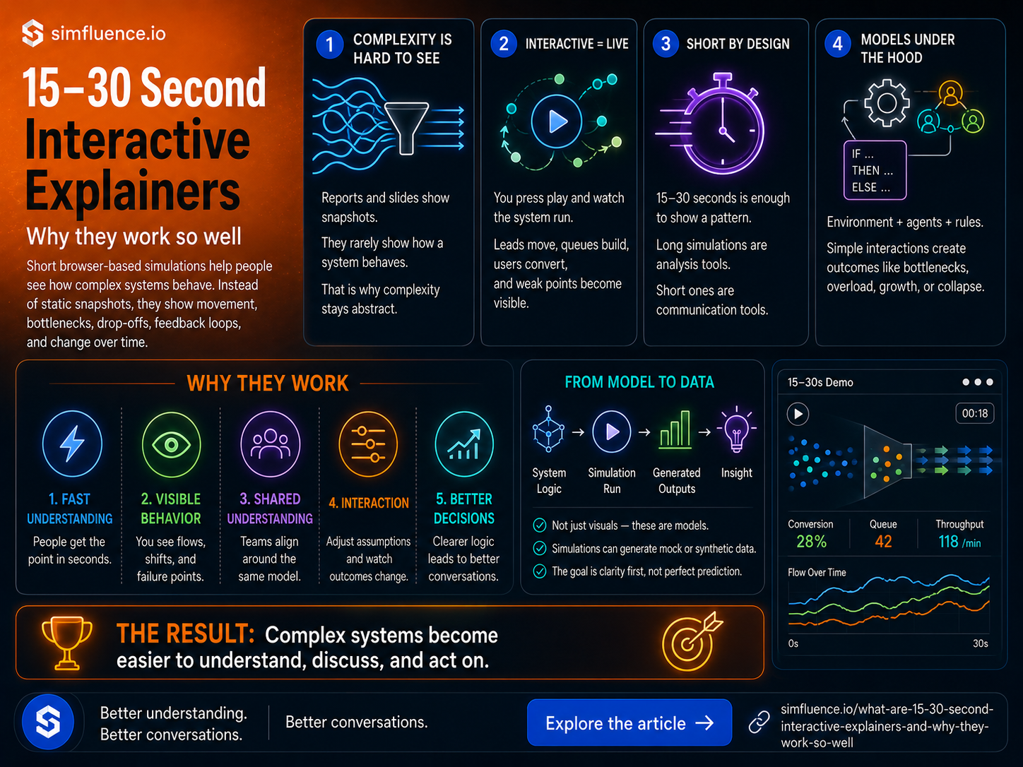
Most business problems aren’t simple.
Sales funnels leak in unexpected places. Operations break down under pressure. Adoption doesn’t grow smoothly—it spikes, stalls, and sometimes collapses.
The issue isn’t just complexity.
It’s that most people can’t see it.
We try to explain these systems with slides, dashboards, and reports. But static charts don’t show behavior. They show snapshots. And snapshots don’t convince anyone.
That’s where interactive explainers come in.
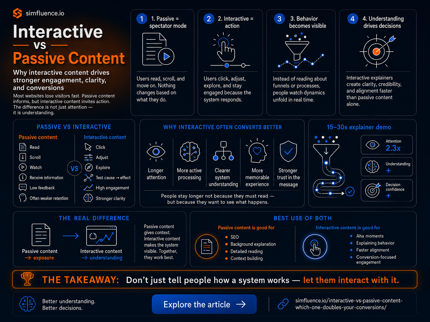
At Simfluence, we build 15–30 second interactive explainers—small, focused simulation widgets that run directly in the browser. You open them, press play (or they auto-run), and within seconds you see how a system behaves.
Not as a description.
As a live system.
Instead of reading about a funnel, you watch leads move, drop, convert, and pile up. Instead of hearing about bottlenecks, you see queues forming in real time. Instead of guessing what happens when something changes, you adjust it and watch the outcome.
That’s the shift. It’s not explanation—it’s experience.
These explainers are short on purpose. Most run in 15–30 seconds. That’s enough to show a pattern, a shift, or a failure point without losing attention. Long simulations become analysis tools. Short ones become communication tools.
And in most cases, communication is the real bottleneck.
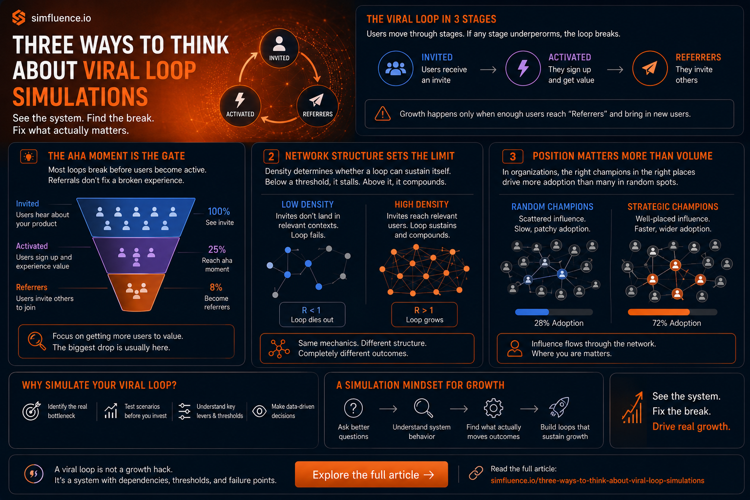
Under the hood, these aren’t just visuals. They’re models.
We build a system: the environment, the agents, and the rules they follow. Customers, users, teams, vehicles—each behaves according to simple logic. When those agents interact, outcomes emerge: growth loops, bottlenecks, overload, collapse.
You don’t need to understand the math.
You just need to see it happen.
A common misunderstanding is that these models “use data” as input. That’s not really the point.
We don’t start with datasets—we start by constructing the system itself. Data can help shape it (or even be used to reverse-engineer it), but the core is the logic of how things behave.
And once the model runs, the simulation generates data.
Every simulation run produces outputs. If the model is based on arbitrary assumptions or weak logic, the output is effectively mock data. If the model reflects real-world dynamics reasonably well, the output becomes synthetic data—artificial, but structurally realistic.
So instead of asking “what data do we feed in?”, the more useful question is:
what kind of system are we building—and what kind of data will it produce?
This matters more than it sounds. Because if you understand a process well enough, you can simulate it and generate datasets that are otherwise hard to access, restricted, or expensive to collect.
But the goal here isn’t perfect prediction.
It’s understanding.
Most tools optimize for accuracy. These optimize for clarity first, then insight.
Because in most organizations, the real problem isn’t lack of data.
It’s lack of shared understanding.
A good interactive simulation closes that gap fast. It turns abstract ideas into something you can see, question, and discuss. It gives people an “aha” moment in seconds.
And that’s usually enough to move a decision forward.
So these 15–30 second explainers aren’t just small demos or visual gimmicks.
They’re a different way to communicate complex systems—one that actually fits how people think.
Short. Visual. Interactive. Clear.