Automation is often explained badly. A company shows the old workflow on one slide, the new workflow on another, adds a few numbers about cost savings, and expects people to understand the transformation. Usually, they do not.
The problem is not that people are against automation. The problem is that automation is still too often communicated as an abstract promise: faster work, lower costs, better productivity, fewer repetitive tasks. These claims may be true, but they do not show how the system actually changes.
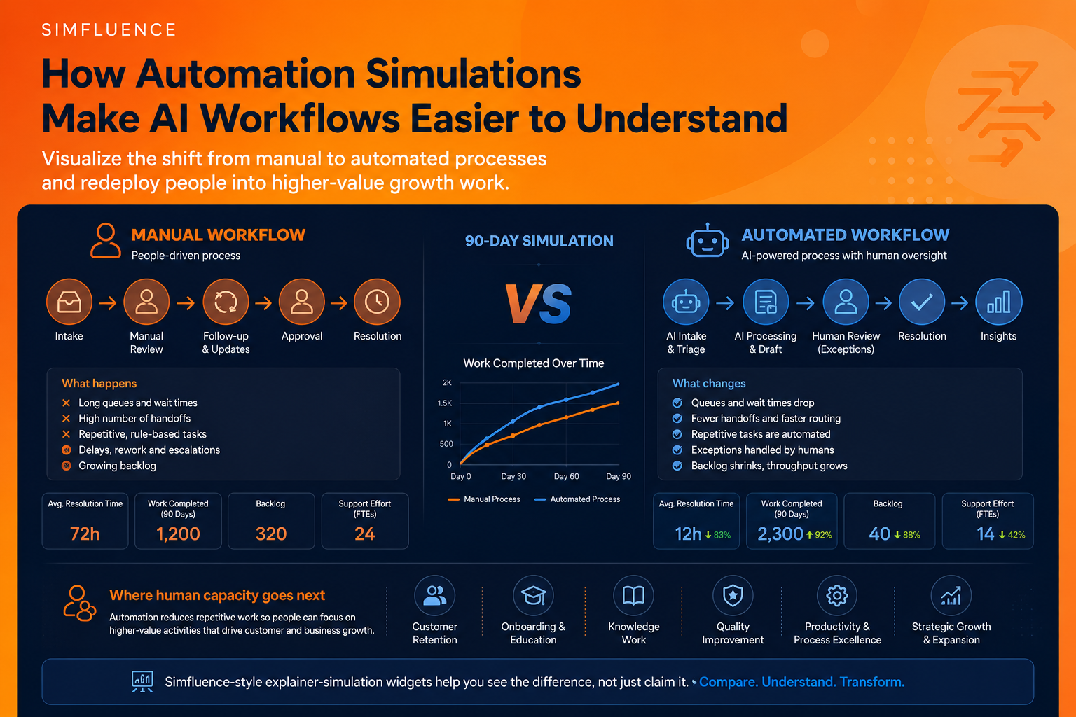
Where does the work move? Which tasks disappear? Which tasks remain human? Where do exceptions still happen? What happens to the people whose capacity is freed?
Those questions are difficult to answer with a static diagram. They are much easier to answer with an explainer-simulation widget.
Static before-and-after diagrams miss the real story
Most automation projects are not simple replacements. They are flow changes. A manual process has queues, handoffs, delays, reviews, repeated updates, rework and escalation points. An automated process changes the rhythm of that system. Some tasks are removed. Some are accelerated. Some are routed differently. Some become exception-handling tasks. Some human roles move away from repetitive handling and toward higher-value work.
That is why a useful automation story should show the old and new process side by side. Not as two boxes. As two behaving systems. This is the logic behind Simfluence-style explainer-simulation widgets. They do not simply tell visitors that a process improves. They show the comparison as it unfolds: manual flow versus automated flow, baseline versus improved scenario, repetitive work versus redeployed human capacity.
The point is not to make automation look magical. The point is to make the change visible enough to discuss honestly.
Automation becomes clearer when people can compare flows
In the AI Customer Support Automation Simulation, the comparison is built around a 90-day support transformation.
The widget compares an automated customer support operation with a manual service workflow. The important part is not only that automated support resolves issues faster. The stronger story is that repetitive support effort falls, while freed capacity can move into retention, onboarding, knowledge work and expansion roles.
That changes the narrative. Instead of saying “AI reduces support work,” the simulation shows a more useful idea: Automation reduces repetitive handling so people can move toward work that improves the customer relationship. That is a much better business story. It is also a more credible one. Most serious organisations are not trying to remove every human from the process. They are trying to stop wasting skilled people on low-value repetition while still keeping humans where judgment, trust, relationship-building and exceptions matter.
A simulation makes that shift concrete. It shows resolution time, support effort and workforce capacity in the same frame. The viewer does not have to imagine the transformation. They can see how the workflow changes over time.
Business process automation needs the same treatment
The same principle applies in the AI Agents for Business Process Automation Simulation. Here, the focus is broader: cycle time, work completed, cost savings and exception rates across a 90-day automation scenario. The widget compares an AI agent workflow with a people-only business process.
This matters because business process automation is often oversold as a clean, frictionless replacement. But real automation is rarely clean. Exceptions still happen. Oversight still matters. Inputs still vary. Rules still break. Human judgment does not disappear just because part of the process becomes faster.
A good explainer-simulation should therefore show both the improvement and the remaining friction. That is where the format becomes useful. A standard ROI calculator can show savings. A slide can show a simplified process map. But a simulation can show the relationship between cycle time, throughput, cost and exceptions in one live comparison.
This gives buyers, managers, employees or stakeholders a more realistic picture. They can see that automation may deliver major speed and capacity gains without pretending that all complexity disappears.
The strongest automation narrative is not “replace people”
The weakest automation story is still the most common one: AI replaces people. It is simple, dramatic and often misleading. A better story is that automation changes where human effort creates value. In many service and operations contexts, the first layer of automation removes repetitive intake, routing, lookup, drafting, updating and basic review. But that does not automatically create business value unless the freed human capacity is redirected well.
That is why “growth work” is such a useful concept. In customer support, growth work may mean retention, onboarding, customer education, proactive success work, knowledge base improvement or deeper issue analysis. In internal operations, it may mean exception handling, process improvement, partner coordination, quality control, better documentation or strategic follow-up.
The value is not only in doing the old work faster. The value is in redesigning the human role after automation.
That is exactly the kind of narrative an explainer-simulation widget can make visible. It can show the manual process shrinking, the automated process accelerating and human capacity moving into higher-value work. This is more persuasive than a generic productivity claim because it answers the question people actually care about: What happens next?
Why explainer-simulation widgets work for automation pages
Automation pages often ask the visitor to believe too much too quickly. They describe a workflow, list benefits, show a few metrics and hope the reader connects the dots. But the reader often has to do too much mental work. They need to imagine the old process, understand the new process, estimate the difference and decide whether the claim is credible.
An explainer-simulation reduces that burden. It lets the visitor see the comparison directly. A good widget can show:
the manual workflow and automated workflow side by side;
how cycle time changes over days or weeks;
how many tasks are completed under each model;
how much repetitive effort is reduced;
where exceptions still remain;
where freed human capacity can be redeployed.
This is useful for product pages, sales conversations, internal change management, training, workshops and investor or stakeholder communication. The same simulation can support several narratives because it makes the underlying system visible.
That is also why short simulations work well. A 15–30 second interactive explainer does not try to become a full operational model. It creates enough movement for the viewer to understand the logic of change. It gives people a quick, testable mental model.
For more on that format, see Simfluence’s article on 15–30 second interactive explainers and the broader page on interactive simulation tools for product demos and scenario testing.
Automation needs better communication, not just better claims
The biggest risk in automation communication is overclaiming. If a page says “AI will transform your process,” the reader may agree in theory and still not understand what actually changes. If it says “AI reduces manual work by 70%,” the reader may wonder what happens to quality, exceptions and people. If it says “employees can focus on higher-value work,” the reader may ask: which work, exactly?
A simulation forces those answers into the open. It shows the old flow, the new flow, the measurable difference and the human redeployment story. It turns automation from a promise into a visible system. That is the real value of Simfluence-style explainer-simulation widgets. They do not just decorate an automation page. They help build a better automation argument. One where visitors can compare, question, understand and believe the change because they can actually see how it behaves.